We've got your back
Sterling Web Trader® Guide
A complete web-based trading solution designed for both stand-alone use and to provide existing STT users access to the markets while they are away from their desktop application.
A complete web-based trading solution designed for both stand-alone use and to provide existing STT users access to the markets while they are away from their desktop application.
To graphically display stock data:
Open a Chart widget window (shown below), if it’s not already displayed. The Chart window is one of the default widgets that is displayed on the opening desktop. An example is shown below.
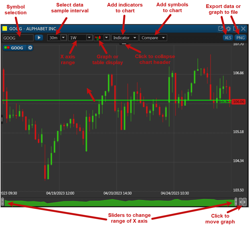
In the above example, note the basic window toolset and selections:
Indicator – When a single symbol is displayed on the chart, various indicators can be added to the displayed chart. Note that when a single symbol is displayed the Indicator pull-down list (shown below) is displayed, where you can select multiple metrics and variables from the pull-down list for display on the graph.

In the example below, the Volume and the Standard Deviation indicators have been selected from the list for display beneath the GOOG stock price chart. Note as well that each displayed indicator has control buttons for modifying/deleting its appearance.

Compare symbols – Use the Compare field to add multiple symbols to the graph for comparison. In the example below, three symbols (GOOG, PEP, TSLA) have been added, and the Compare field is open for adding a fourth symbol.

Note the delete  icon in each symbol name, which is used to delete the symbol from the chart.
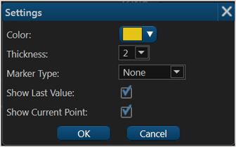
Note as well the settings  icon for each symbol. Clicking it allows you to adjust the display settings for that symbol on the chart, as shown:
Mouse over – When mousing the crosshair over any segment of a graph line the underlying data for that point is displayed. In the example below, the orange-colored symbol (TSLA) is moused over on 4/18/23. Note the display of the meta data, as well as the percent price change (-2.65%) in the right margin.

 to download an Excel worksheet containing the data currently displayed on the chart. Or click on
  to download an image file showing the currently displayed chart.
 sliders on the left and right allow you to quickly decrease the displayed date/time interval using your mouse to “drill down” into the displayed data.